Graphic Design Tips for the Non-designer
November 1, 2023

7 Graphic Design Principles to Up-Level your Graphics
Graphic Design is the process of visual communication, and problem-solving through the use of type, space, image and color.
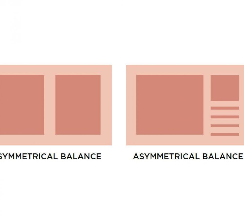
1 | Balance
Your graphics need to have a sense of balance. This isn’t to say that each
side needs to be perfectly symmetrical, but the amount of visual weight
on each side should feel cohesive and intentional to create this feeling of
balance.
2 | Proximity
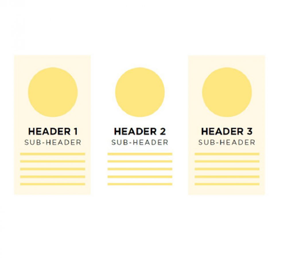
Proximity is when you group related items together so that it is visually
clear they’re related. This helps create organization within your graphic
which causes information to be remembered more easily. Our brains love
organization, so when a graphic is organized appropriately, it’s both
visually appealing and easier to consume.
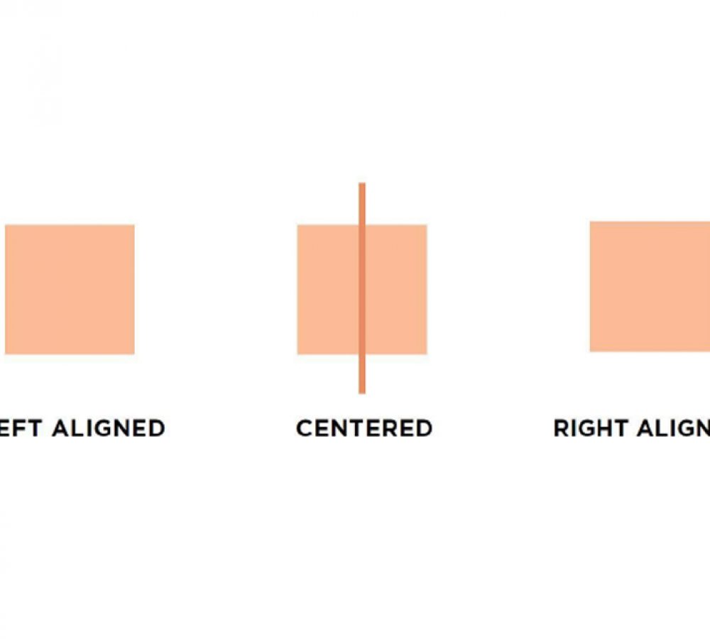
3 | Alignment
Every design element placed in your graphic should be visually aligned to
something else on the page. Whether that’s the side of the page, the edge
of an image, the text that’s above it, etc. Nothing should be placed
arbitrarily on the page. This is probably the #1 beginner mistake I see in
graphics and possibly the easiest to fix.
4 | Repetition
Repeating certain characteristics (ie. fonts, colors, layouts, design elements,
etc.) within your design will keep the design unified and cohesive. This then
creates a visual theme that creates this unification and consistency. This is
especially helpful when designing multiple related graphics or a multipage
document because the repetition of design elements will tie them all together
and make them feel unified and consistent. Repetition is also the number one
way to create a recognizable brand identity.
5 | Contrast
If two items are not exactly the same, make them different. And it most
cases, make them really different (while still keeping them within the same
visual theme, of course). This creates more interest on the page and
makes certain elements stand out among the rest. This also creates visual
hierarchy, which aids in the organization of the graphic (we’ll get to
hierarchy in a second).
6 | White Space
“White space is the art of nothing” – I have no idea who said that but it
wasn’t me so I put it in quotes. Nonetheless, I thought it was a great way to
describe this concept. White space is the absence of text and graphics.
This can also be referred to as negative space and therefore, doesn’t
actually have to be white. White space can be whatever color the
background is.
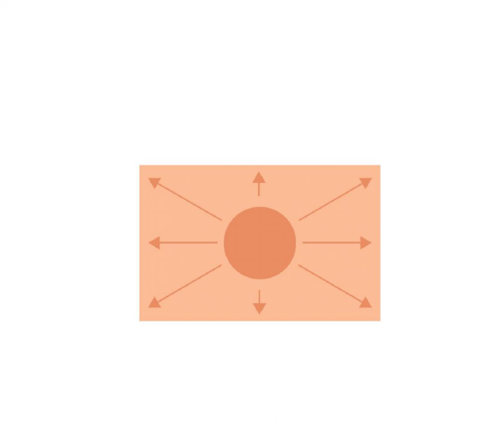
7 | Hierarchy
The definition of hierarchy is “a system or organization in which people or
groups are ranked one above the other according to status or authority.”
Hierarchy, when implemented, literally creates a path for your eye to
move around the page. Yes, you can in fact control how the viewer
consumes your graphics. Viewers will start with the most dominant feature
of your graphic, then move to the next dominant, and the next until they’ve
looked over the entire thing.
Don’t get intimidated by the concepts. Strip it down to some basics and start your journey there.
Recent Posts
Have Any Question?
Please contact us directly and let ‘s talk together and begin the journey …
- (+973) 394 - 687 - 31
- support@freespace4media.com
Join Our Newsletter
Get our latest news & useful articles regularly and special offers.
Work Hours
- 9 AM - 10 PM , Saturday - Thursday
Road 827, Salmabad. Kingdom of Bahrain.
Media & Digital Marketing Agency by www.fressspace4media.com




Deprecated: File Theme without comments.php is deprecated since version 3.0.0 with no alternative available. Please include a comments.php template in your theme. in /hermes/bosnacweb07/bosnacweb07ay/b1146/dom.freespace4media53329/wp_site_1676401832/wp-includes/functions.php on line 6114